How Do You Create Contrast In Interior Design?

When you walk into any interior design showroom, contrast is a design element that should not be the focal point but rather a pleasant discovery after taking in the visual appeal of the entire space. It is so important to the interior design of a space that it can also often be mistakenly, overdone. So, what is contrast and how do you use it successfully?
In simple terms, contrast is the balance between two or more different things. In interior design, you create contrast (or a lack of it) with every decision you make. Here’s how to make the right decisions to add contrast with intent and a design-focused eye.

Understanding Contrast in Design
Contrast, the balance between things, pulls your space together by making it look purposeful. Even if your style is eclectic and maximalist, your space will appear messy if you don’t balance your space with the right amount of contrast. This is to say that contrast is for every home, no matter your style. How you use it will depend on your aesthetic and your home’s needs, as well as the extent to which you use it, but contrast is as important as any other step in the process.
There are 7 interior design elements that guide the creative process:
- Space
- Form
- Light
- Color
- Pattern
- Line
- Texture
These are the basic principles that need to be considered and balanced to create spaces that inspire and feel put together with intent. Intent is key when decorating a space—even if your aesthetic leans towards the laid back and less put together atmosphere, this is created with careful consideration in the interior design process.
We use these 7 elements of interior design to create contrast. Many people only think of contrast in terms of just color and texture, but there is so much more to consider. Each of these elements requires a balance to work in a space. Light cannot be under-utilized or too overpowering, and texture needs to be offset or it can be an eyesore.

1. Space
Although the dimensions of a room can’t be changed without more intensive renovations, interior designers can work with how a space is viewed from a décor perspective.
There are two central concepts here: Positive Space & Negative Space. Positive space refers to parts of the room that have furnishings in them, and negative space refers to spaces without furnishings.
By balancing positive and negative space, contrast is created between these areas. You do this to draw the eye to a certain area, changing the first impression and perspective of those entering the room. You can draw the eye to focal furnishings, away from awkward corners, or towards a particular functional section of the room such as a bed or a desk.
2. Form
Form refers to the shape of furnishings and design items. It encompasses a scale from organic-shaped designs to geometric-shaped designs depending on how natural or manmade it looks.
Organic shapes can be home accessories like plants or nature-inspired designs. Geometric forms, on the other hand, are made of repeating patterns and straighter lines. Both of these can work alone or in a balance depending on your architectural style, but contrast can be achieved within each form, as well. W
hen you walk into an interior design showroom, you will see many kinds of objects. Some are ornamental, some are closed (like boxes or drawers for storage), and some are open (like open trays on a bar cart). Too much of one thing is never a good idea, and this is where contrast in form can help build your space.
3. Light
There are many ways to add contrast with light. In fact, it is one of the easiest ways to balance a space. Your lighting solutions should be balanced around your furnishings, with functional lighting meeting aesthetic choices to create the atmosphere you’re after and adequately illuminate your kitchen, entertainment area, or workspace. Contrasting lighting fixtures with both natural lighting and other furnishings creates visual intrigue.
4. Color
Color is another clear choice for creating contrast. Even for those who are not so design-minded, creating contrast with color is an easy endeavor.
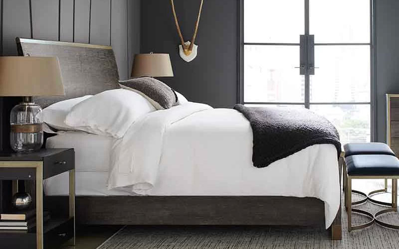
Opposites are key when choosing contrasting colors: black and white are the most well-known contrasting colors, but if you want to get more involved, it’s time to look at a color wheel.
Choose colors that are on opposite sides of the color wheel to find their perfect contrast partner, and you’ll find new mixes like blue and orange, which work exceptionally well together.
5. Pattern
Patterns need to be offset either with no pattern or with a different pattern. We know that too much of one thing can overpower a space, and this is especially so for patterns on wallpaper and furnishings.
Good contrast is created when the pattern and its partner work hand in hand to balance a space rather than overpower it. We match a patterned area rug with a monotone couch or a marble kitchen countertop with a plain backsplash. By contrasting these elements, you give space for the pattern to stand out.
6. Line
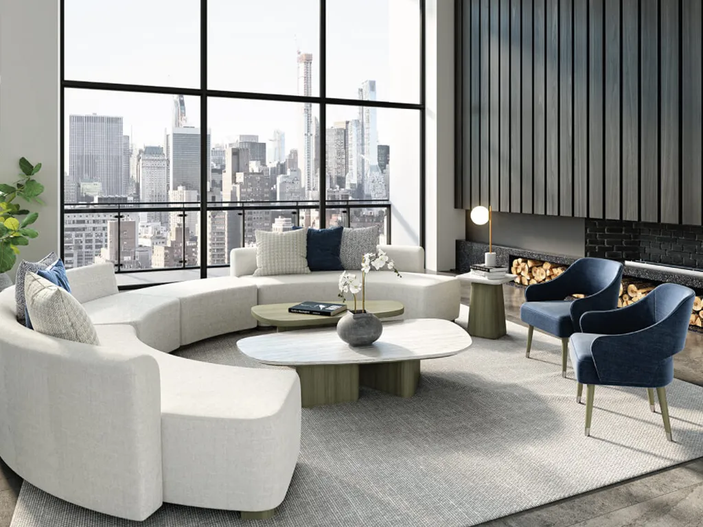
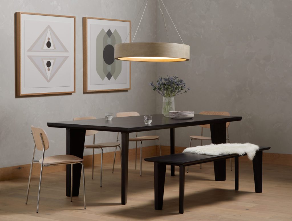
Lines play a greater role than you think. Our spaces are made of straight (static) and curved (dynamic) lines, like straight edges on a dining table and round edges on an armchair.
Contrast between straight and curved lines means adding visual differentiation and balance to create a space that feels natural. If every line is straight, the room may have an unsettling atmosphere.
Interior designers use lines in complement and in contrast to help draw the eye to certain areas and create certain aesthetic styles.
7. Texture
The final design element, texture, is equally important. Texture is just as much about the visual sense as it is about the tactile sense, and these need to go hand in hand.
Contrast in textures can be as simple as balancing a highly textured couch with a smooth glass coffee table, but it can also be much more difficult. Some of these design elements require a trained eye to implement, and this is where we’re here to help.

Achieving the Interior Design Showroom Feel
When we talk about designer showrooms, we don’t mean for your home to literally feel like one. After all, your home reflects your own desired atmosphere and inspirations, and showrooms can be an eclectic mix of many styles. What we talk about is the showroom feel of an area being well put together with intent, with all the design elements in mind, and contrast achieved at every step.
At Designers Mark, we have been assisting our clients find their inspiration and style, creating complements and contrasts that elevate a space. We want you to be inspired and excited about your new home, and our interior design consultants are available to make the design process simple.
Ready to Make Your Mark?
Give us a call today at 561-961-4149 to schedule an appointment at our Boca Raton interior design showroom or visit the Designers Mark Instagram page for inspiration.